
Projects
Designing scientific articles
Improving engagement, trust, and impact
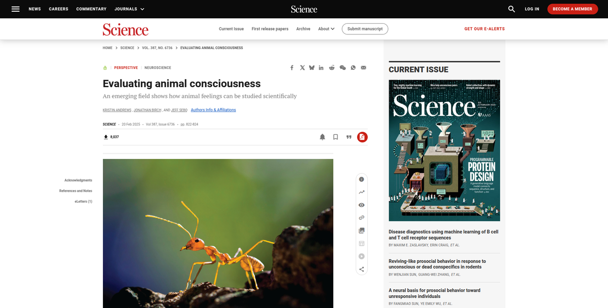
In academic publishing, article pages are the main output of research. They are the gateway to share findings, discoveries, and insights. At a scientific publisher I've worked with, these pages accounted for the majority of website traffic.
Yet, despite an impressive reach, the bounce rate was high, with most users leaving quickly. We were drawing researchers in but failing to engage them, and a closer look revealed why. Navigation was clunky, readability was low, trust signals were buried, and pathways to interesting content were practically non-existent.
This was a missed opportunity. By improving usability and engagement, we could boost article reach, impact, and drive greater trust and submissions—all critical for journal sustainability and growth.
Through prior leadership in mapping the holistic scientist journey, I had already identified critical moments where researchers struggled. With this knowledge, I aligned with key stakeholders—product leads, innovation managers, and designers— on a single, compelling goal: transform the article page experience to create tangible impact for researchers and our published content.
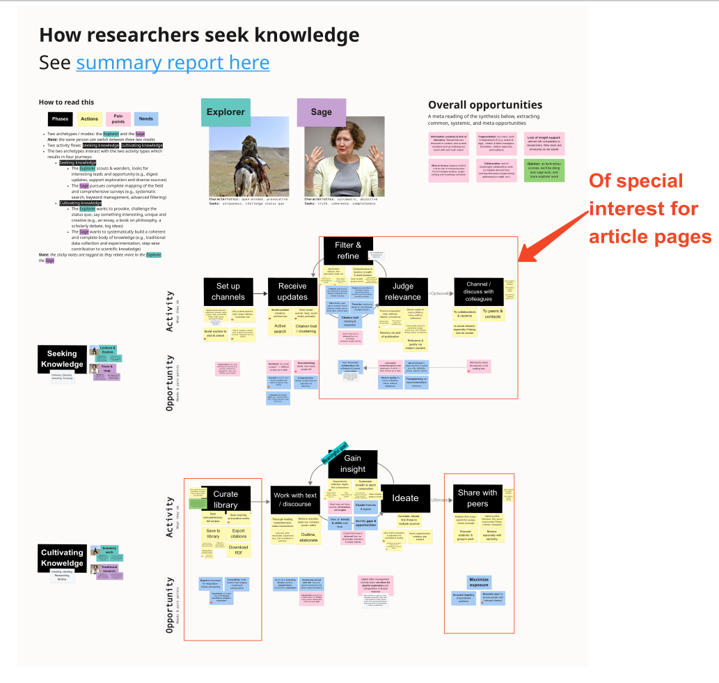
Researching how researchers read
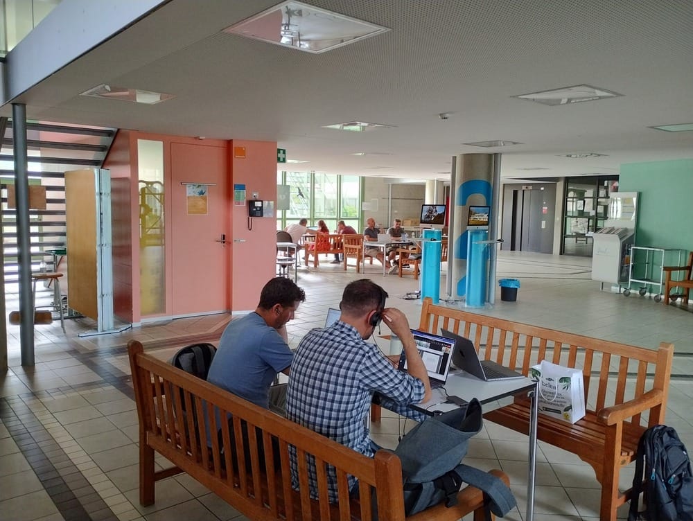
We started by listening. The first step was understanding how researchers interacted with the scientific articles. I led in-person user tests with researchers at a top university in July 2023, diving into their workflows and frustrations.
From these tests, certain patterns emerged:
- Non-linear reading: Researchers jumped between abstracts, figures, and conclusions, but the interface made this tedious.
- Trust signals: Authors, affiliations, and metrics were either poorly displayed or absent, undermining confidence in the content.
- Checkout challenges: Downloading articles or exporting citations—a critical next step—was buried in convoluted interactions.
It became clear that users needed intuitive tools that aligned with their natural behavior and respected their time.
Design sprint: building momentum, dissolving silos
With these insights as our foundation, I co-facilitated a three-day design sprint on-site. The team, comprising designers, PMs, and engineers, approached the challenge with a mix of rigor and creativity. This helped us involve our engineers and stakeholders from the beginning, building ownership of scope and design.
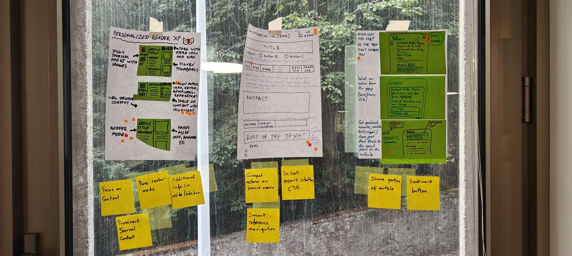
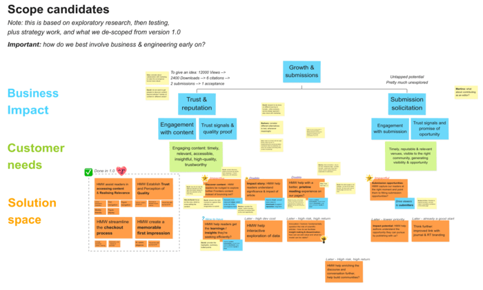
We began by mapping the researcher’s journey and framing the problem through "How Might We" questions:
- How might we make navigation seamless for non-linear reading?
- How might we elevate trust signals without overwhelming the interface?
- How might we facilitate checkout for later, in-depth reading?
With rapid ideation and with iterative sketching, ideas emerged for sticky navigation, inline figure previews, and streamlined citation exports. By the end of the sprint, we had a consolidated low-fidelity sketch that addressed these pain points and set the stage for design.
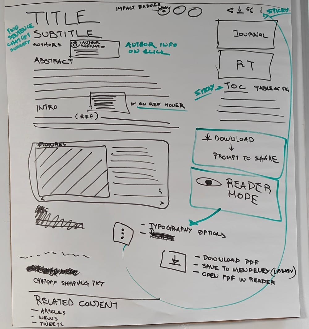
Product management & design
Following the sprint, the focus shifted to maturing the design and translating concepts into actionable specifications. Here, I stepped into a dual leadership role: orchestrating the collaboration between two senior designers and ensuring alignment between designers, the business, and engineers.
To push the boundaries of our design system while respecting its identity, I invited senior two designers with contrasting styles:
- The first, a structured pragmatist, emphasized clean visuals and adherence to established guidelines in the design system.
- The other, a futurist maverick, thrived on challenging norms and exploring innovative possibilities.
This pairing wasn’t without its challenges. The designers’ differing approaches occasionally clashed, so it required sensible mediation to ensure synergy and synthesis. Proposals from both were integrated into a final outcome that balanced innovation with rigor, culminating in an attractive, functional, and robust design.
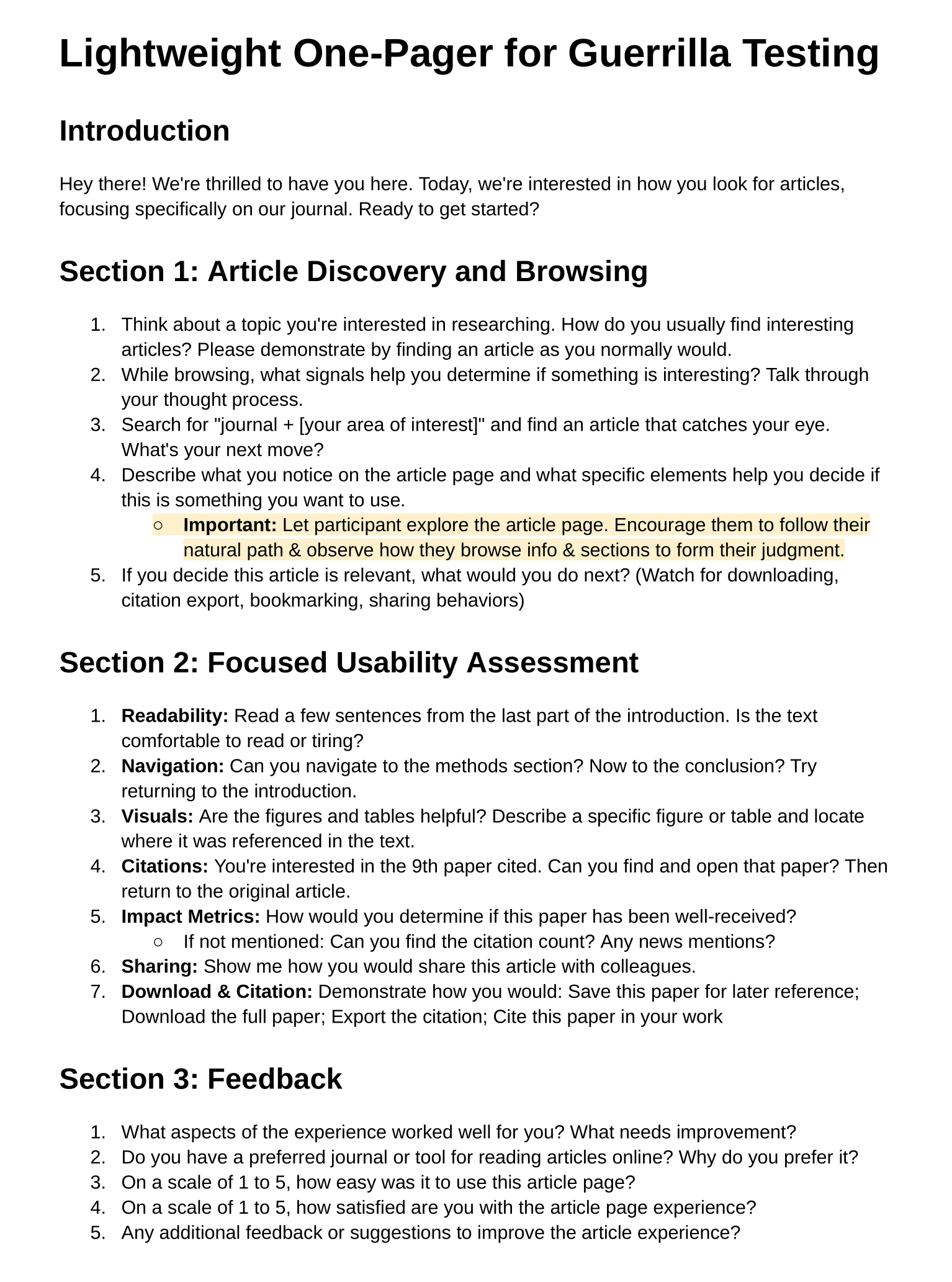
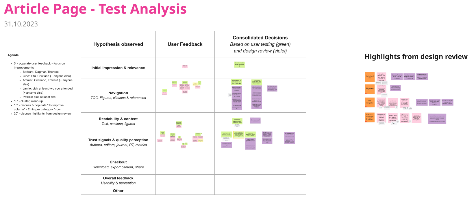
The resulting prototype underwent usability testing with eight researchers. These sessions validated our approach while surfacing areas for refinement:
- Researchers appreciated the sticky ToC and inline figures, but requested better visibility on load.
- Trust signals like author affiliations and citation counts resonated strongly, though some details required clearer presentation.
Parallel stakeholder design reviews ensured alignment with business goals, emphasizing mobile optimization and strategic placement of CTAs for downloads and submissions.
Development & pilot
With a polished design in hand, the transition to development was smooth. Thanks to early involvement since the design sprint, the engineering team was prepared to bring the prototype to life. I collaborated with the PM and engineers to draft user stories, ensuring clarity and alignment. Key features included:
- A sticky ToC that adapted seamlessly to desktop and mobile.
- Inline figure navigation for quick, immersive exploration.
- Prominent display of trust signals, such as ORCID links and author affiliations.
Once implemented, we planned to pilot using A/B testing across journals of varying disciplines and sizes. We planned to measure retention, engagement, and conversion.
Results:
- User satisfaction: Initial data indicated a 40% improvement in user satisfaction, particularly with navigation and readability.
- Behavioral outcomes: Time to task on section finding, information finding, and download decreased by over 50%. ToC interactions rose by 40%, and downloads increased by 30%.
- Business Impact: These gains suggested a potential for higher citation rates, improved journal impact, and increased submissions.
Next release: from engagement to growth
With the redesigned article pages covering the important basics, we turned our attention to the next phase: extending the convergence funnel. This phase aimed to address three key opportunities:
- Content discovery: Nudging readers to explore related articles, leveraging recommendation engines and behavioral data.
- Submission opportunities: Introducing context-aware CTAs to guide researchers toward relevant journals and special issues.
- Impact storytelling: Showcasing the societal and scientific influence of articles to build trust and inspire engagement.
Workshops and kicked off this phase, with prototypes already in development. Stakeholders were aligned, and the momentum from the first phase ensured a smooth transition into these new challenges.
Conclusion: designing engagement
This initiative was about subtle interventions to optimize how researchers interact with published material. By combining rigorous research, collaborative design, and strategic leadership, we achieved a redesign that delivered a meaningful change for users and the business.
- Researchers found a tool that respected their browsing and reading flows and inspired quality and trust.
- The publisher gained a platform to drive downloads, research impact, and submissions, establishing a virtuous cycle.